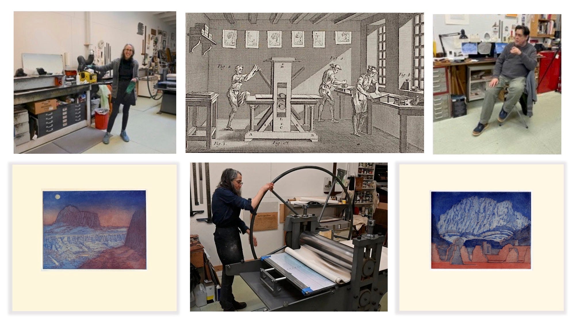
Were the series of articles I have published on Substack over the past month to be packaged as a book, this would be its backmatter. Like most artistic practices, printmaking has its own particular argot of terms that would be mysterious to many readers. A quick Internet search will lead to dozens of glossaries, posted online by organizations such as the Print Club of Cleveland. One of its members visited Michael Costello and I, during one of our monoprinting sessions last year, at Hand Graphics in Santa Fe. He also purchased several prints from Gerald Peters Gallery.
People talk about the art world as a singularity, when it is anything but. Among the many subsets that might comprise its totality, the modern & contemporary print market is probably the largest—running the gamut from brass rubbings and Gyotaku; 魚拓 (fish-printing), to Warhol serigraphs and other blue-chip limited editions. Art prints can be found anywhere from high-powered print fairs to galleries and museum gift-shops, to upscale farmer’s markets. When the art-print publishing industry came into being roughly three hundred years ago, its target audience was a growing middle class that aspired to domestic refinement, but could not yet afford original artworks. The invention of lithography in the late 18th century revolutionized art publishing by producing color prints, at a fraction of the cost of hand-colored engravings. As newer technologies replaced earlier techniques, studio artists adopted newly obsolete methods; both to expand their oeuvre, and increase their market. With the rise of digital technology, and even three-dimensional printing, the sky’s the limit of what today’s artists can do. A mystique abides in hand-pulled prints, stamped into paper from ancient mills, with inks made from earth and minerals, on presses like iron dinosaurs, in shops scented with oils and solvents. There is a certain alchemy in the physical process, that is conveyed to finished prints. James Elkins describes something comparable, in his wonderful book What Painting Is.
Imagine that you are in a gallery for the very first time, looking at an unframed print. A salesperson stands nearby, describing the piece in a torrent of jargon. You nod politely, because while you don’t understand what was said, you wish to appear knowledgeable. Should you ever find yourself in this situation, here’s what you need to know.
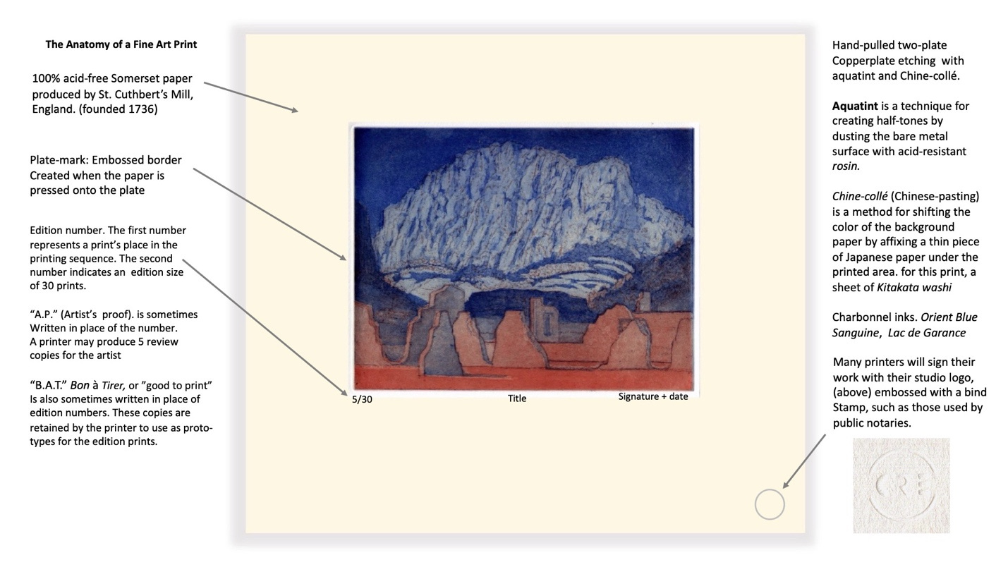
A finished etching is made by exposing a zinc or copper plate to acid. This creates incisions that are filled with ink, then pressed with great force onto a sheet of pH-neutral rag paper sufficiently thick to accept the impression. Incisions can be made by scratching the plate with a steel needle (drypoint), or by inscribing lines through an acid-resistant ground, or by applying an aquatint—pulverized tree-sap scattered across the plate in an acid-resist to make half-tones. The substrate can be modified by sandwiching a sheet of Japanese washi, or other colored tissue, between the plate and the etching-paper. Some printers will use newsprint or bond paper to gauge some of their progress, but serious impressions are printed on archival pH-neutral rag paper. Printers’ inks are milled in the same way as artists’ oil paints, but possess lower viscosity. Water-based inks have increased in use of late, but traditionalists continue to print with oil-based inks. When viewing a finished print, there are several things to look for.
1. Paper. The surface of fine etching paper exhibits a softness, or at times it may bear a texture imparted by the weave of the blotters between which the sheets were pressed and dried. Machine-cut edges are rare in hand-pulled prints. A deckle, or uneven edge of varying thickness is like the selvedge in textiles. It attests to the sheet having been laid, or formed its own frame, and not cut from a roll. To cut a sheet, printers might fold the paper, and then strike the inside edge of the fold with a bone-knife or metal bar. This makes a frayed edge that resembles a deckle.
2. Plate-mark. Because an etching is made by pressing the plate into the sheet, the exterior edges of the printed image will be stamped into the page, which raises slight borders around the image. Flip the sheet over. The shape of the plate will be embossed in low relief on the verso. Lack of a plate-mark could indicate that the plate is not a true etching.
3. Blind stamp (chop). Many professional artists and printers may blind-stamp their works, in the same way that notaries will put their seals on legal documents. It is how the printer signs their work, and verifies that the print was produced in their shop. Printers’ blind stamps are unique in design, and smaller than notary seals. For example, Michael Costello’s chop is a hand (for Hand Graphics) inside a rectangle. Cindi Royce Ettinger’s is a stylized CRE (her initials) inside a circle.
4. Inscriptions. The only person who writes on the finished print is the artist who designed the image. These inscriptions will be hand-written with a graphite pencil. Beneath the left-hand corner will be a description of the print, in relation to its edition. A.P. or “Artist’s Proof” indicates a print in its final state. These can vary slightly, until one is designated B.A.T., or “Bon a Tirer;” in French literally “good to pull.” In shoptalk, printmakers do not print prints. They “pull” prints. “The Bat” is kept by the printer, who uses it as a guide in printing the rest of the edition. Because there might be several A.P.s in any edition, and only one B.A.T., these can command higher prices. The title of the print is written under the center of the print, while the artist’s signature and year of production are inscribed below the right-hand corner of the image. A diagram of these features appears at the head of this article. I hope these articles have piqued the readers’ interest. Let me recommend a few books, should anyone wish to delve deeper into the subject:
Sylvie Covey. Modern Printmaking: A Guide to Traditional and Digital Techniques. Watson-Guptill., New York. 2012
Rena M. Hoisington. Aquatint: From Its Origins to Goya. Princeton University Press. 2021
Joann Moser. Singular Impressions: The Monotype in America. Smithsonian. 1997
Gabor Peterdi. Printmaking: Methods Old and New. MacMillan. 1959
Donald Saff. Printmaking: History and Process. Holt, Rinehart, and Winston. New York. 1978
Thanks for reading!
—James Lancel McElhinney © 1979
READ more about PRESSING MATTERS: Adventures in Printmaking: